Member-only story
How to explore the golden ratio in design and typography
The secret lies in 1.61803398875
Looking at designs, typography, and works of art based on the golden ratio always makes me smile and cheer.
A lot has been written and explained about the golden ratio since antiquity. Mathematicians, theorists, architects, artists, and designers believe it to be aesthetically pleasing, delightful, and visually recognizable in natural forms, such as in sea shells, flower petals, and even spiraling galaxies.
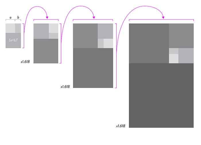
While mathematicians dig deep into the golden ratio number theory, which is basically a relationship of a/b = a+b/a = 1.618, for designers, the important relationship is between two squares, plus their sum of 2 sides squared, to form a new rectangle of squares that, when 1.618 times larger, will have the same short side value as the long side value of the originating squares.
In other words, it’s a little complicated, and it’s easier to visualize it than to do the math. The relationship of the proportional 1.618 value can be illustrated like this:
Example 1: The relationship of the long- and short sides of the sum of the squares

This example can be shown as an ever growing square consisting of many squares enlarged by 161.8%.
We now have a compositional grid structure that can be of great value for designing in harmony and aesthetically pleasing.
Example 2: The golden ratio grid colored

Example 2 shows us the eye-pleasing nature of the golden ratio, the relationship of 1.618, as shown in example 1.
When we look at the relationship of the golden ratio in nature, we can see it succinctly in the spiral form that emerges when diagonally connecting the even squares.
