Member-only story
Designing community icons using UX Gestalt principles
3 examples to define iconic UI elements for your design projects
What is community as a concept?
Community is in essence a feeling of fellowship with others, a combination of sharing common attitudes, closeness of interests, and similarity of goals. We can also refer to community as a social group, a collective of friends, or a neighborhood.
There are many ways to interpret community. To design community in an iconic and expressive way, we can use a foundational UX design tool, the Gestalt principles, as an ideational guide.
What are Gestalt principles?
Gestalt principles are conceptual perceptions that the human brain will organize visual content in a most effective way.
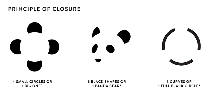
For instance, using the Gestalt principle of closure, our brain waves will effectively close a line to process visual information fully.

In this example of a Gestalt principle, looking closely at the three illustrations, we realize that each one is a combination of a bunch of shapes. But our brain fills in missing information, and we perceive the icons visually as a meaningful render of a thing, being, or object.
This is an interesting insight as the concepts embedded in the Gestalt principles can help us to design difficult-to-render ideas and represent them visually.
Most common visual Gestalt principles we can use to ideate on community
For this essay, we’ll focus on the top three UX Gestalt principles:
Similarity, proximity, and common region
Let’s explore!
Community through similarity
Applying the Gestalt principle of similarity, where similar items get grouped based on their attributes, we can play with similar shapes, place them in the same location, and contextualize the story.
